WhatsApp's iOS Navigation: The Smart Shift Beyond Basic Controls
WhatsApp is strategically refining its iPhone interface with sophisticated navigation elements and a chat list overhaul, moving beyond basic app navigation to elevate in-conversation efficiency and user organization.
AI-generated image
In the fast-evolving landscape of mobile applications, even minor interface tweaks can ripple through the daily routines of millions. WhatsApp, the messaging behemoth, is once again demonstrating this principle with its ongoing overhaul of the iPhone chat navigation. What might seem like a mere facelift is, in our view, a concerted effort to deepen the app's usability and streamline workflows, especially for power users.
Recently, with version 26.39.75 hitting the App Store, iPhone users began to see a new navigation experience for individual and group chats. This isn't an isolated incident; it follows a significant redesign of the chat lists interface (version 26.21.74) that landed earlier this year. Taken together, these changes signal a purposeful drive to adapt WhatsApp to modern iOS design paradigms while addressing long-standing user pain points.
The core of the latest update revolves around a new button in the in-chat navigation bar. This button, which displays the contact's profile picture, name, and online status, replaces the simpler name-only display, especially enhancing readability within the app's new Liquid Glass visual style. Tapping it reveals a translucent pop-up menu at the top of the screen, offering quick access to functions like "Search," "Contact info," "Media, links and documents," "Chat theme," "Disappearing messages," and "Mute" for individual chats, with additional options for groups and business accounts, as reported by HWUpgrade.it. This is a welcome shift from hunting through multiple layers of menus.
Rethinking In-Conversation Accessibility
While WhatsApp on Android has featured a bottom navigation bar since March 2024, making key sections like Chats, Updates, Communities, and Calls accessible with a thumb-friendly layout, as noted by Tom's Guide, iOS has also utilized a similar bottom navigation bar for main app sections—including Chats, Calls, Communities, Updates, and Settings—for some time, as users have noted on Reddit. This commitment to thumb-friendly access for core app navigation is clear across both platforms. The new in-chat menu on iOS offers a different, yet equally valuable, form of streamlined access: by consolidating frequently used actions within a conversation into a single tap, it enhances convenience without disrupting the chat flow. Instead of navigating to a separate contact info screen, users can now quickly access what they need directly within the chat interface.
Furthermore, this update builds upon an earlier, equally significant revamp of the chat lists. The introduction of a customizable "Filter" button and the ability to manage custom chat lists allows users to pin essential categories like "Unread" or "Groups" while tucking away less-used ones, vastly improving how one scrolls through a busy inbox. This addresses the frustration of horizontal scrolling and the inability to hide permanent, yet unused, filters like "Favorites," as detailed by Apple GadgetHacks. It's a pragmatic step towards decluttering and personalizing the primary interaction surface.
The Power of the "Drafts" Filter
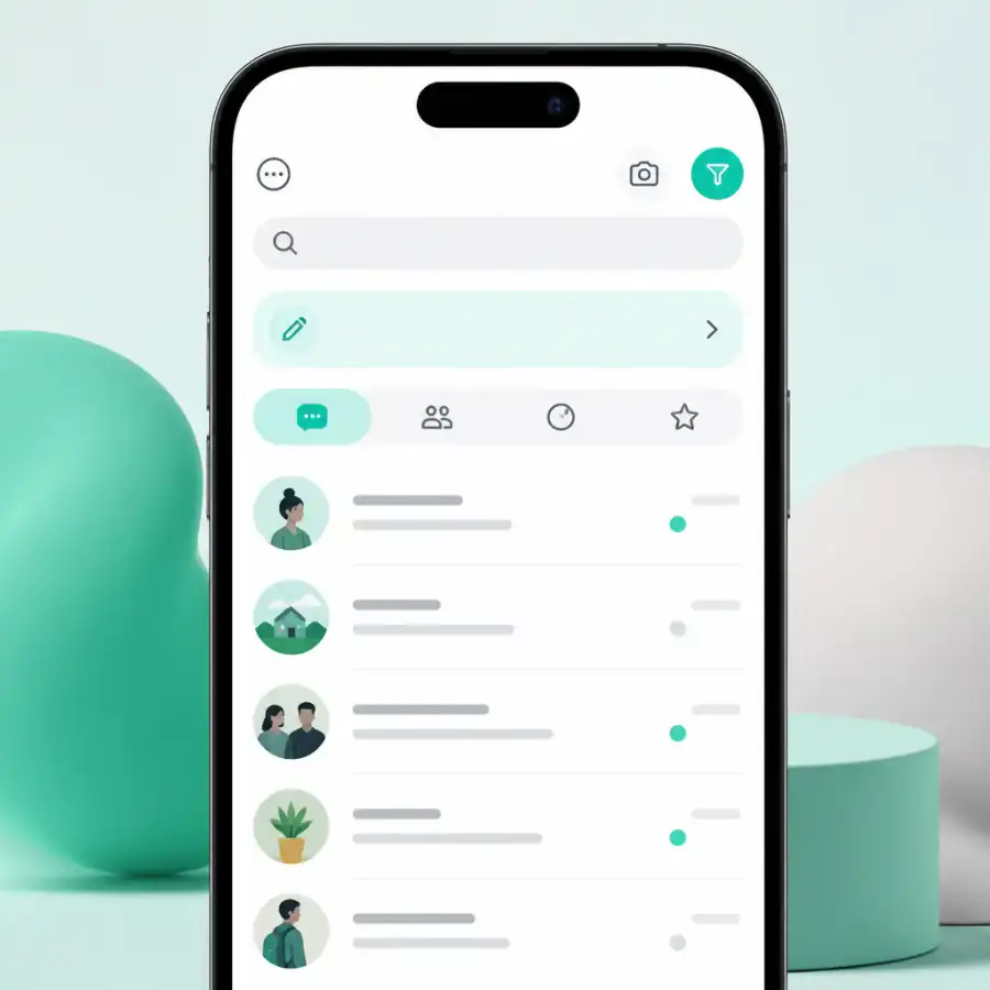
Among the most impactful additions in the recent chat list redesign is the new "Drafts" filter. This seemingly small feature aggregates every conversation where a user has started composing a message but left it unsent. Before this, tracking down a half-written reply meant manually scanning through an entire chat list for a green "Draft" label—a tedious task for anyone managing multiple conversations. Now, with a dedicated filter, finding and completing these pending messages transforms the Chats tab into a more active, task-oriented workspace.
This is a testament to how WhatsApp is evolving beyond a simple messaging platform into a tool that supports greater productivity. The "Drafts" filter isn't just about organization; it’s about reducing cognitive load and preventing forgotten replies. For busy professionals or those juggling complex social circles, this can be a game-changer, turning a passive inbox into a more actionable interface.
A Gradual but Meaningful Evolution
It’s crucial to remember that WhatsApp's rollout strategy is characteristically cautious. These features are being distributed gradually, often activated via server-side flags, meaning not all users on the latest app version will see them immediately. This measured approach allows Meta to monitor performance and gather feedback before universal deployment. However, the direction is clear: WhatsApp is committed to an iterative refinement of the iOS experience.
The integration of the Liquid Glass design throughout the interface, from navigation bars to chat elements, further solidifies this commitment to a cohesive and modern aesthetic, aligning WhatsApp more closely with the broader iOS ecosystem. While these updates might not be revolutionary in isolation, their cumulative effect points to a WhatsApp that is increasingly user-centric, addressing fundamental usability and organizational challenges head-on. For iPhone users, it signals a more efficient and visually harmonious future for their most essential messaging app.
No topics yet: start the first one.
More stories
Sony's ECM-AX10: The Spatial Audio Mic That Could Redefine Mobile Storytelling
Sony's new ECM-AX10 USB-C microphone for smartphones, with its Eclipsa Audio certification, promises to open the door to immersive spatial sound, transforming how mobile content creators capture and share their world.

Apple's Home Event: The Screen-First Hub That Reinvents Smart Home
Apple's October 13th 'Home' event is expected to unveil a screen-equipped smart home hub, marking a pivotal shift from audio-centric speakers to a central, visual ecosystem experience.

NFC Transforms Google Find Hub: The Hunt for Lost Items Just Got Smarter
With NFC integration, improved setup, and native lost-item reminders, Google's Find Hub is poised to become a formidable challenger in the competitive market for tracking devices, offering users a more intuitive and widespread solution.

WhatsApp's Forced Upgrades: Security Imperative or Obsolescence Push?
WhatsApp's new server-side blocks, citing security for outdated Android and iOS versions, compel users to upgrade their devices for basic functionality, underscoring constant pressure within the smartphone ecosystem.